In this blog post I’ll go over ways in how we can make our UI more exciting and integrated into our games.
How do we make our UI exciting?
For some games, they have the answer. With enough animations, “juice,” and positive feedback, experiencing the UI is as important of a feature as playing the rest of the game (perhaps THE feature). But for most games, however, UI is seen as an unfortunate hurdle that has to be implemented into a game. Players need to be able to set options and start the game on their own time. They also need to know the status of their character or object they’re playing as. Being locked into the digital space, the player cannot create opinions about the objects in the world without the necessary feedback. How can we turn the “necessary chore” of making UI into something exciting for the player?
Exciting UI harks back to the mindset of striving to make every aspect of your game have a sense of purpose. If we want to craft a game that the player has a positive experience with, then we need to make every part of the game enjoyable. This isn’t to say that our UI has to be over the top. On the contrary, UI needs to fit strongly within our theme so it feels like it’s a part of the game. A difficult conundrum with UI is that it is overlaid on the screen, as we find with the “Heads Up Display” (HUD) during the game. This can feel separated from what’s happening in the game world. The player could be a small child, but if you open their pockets they can have multiple kinds of objects (is that a table in there?), seemingly impossible to carry in real life. This isn’t necessarily a problem, as it’s a game, and the goal of the developer is to not inconvenience the player from getting the result they want.
Hold on, let’s say that again: Developers shouldn’t inconvenience the player from getting the results they want. Players want results. They are purchasing your game to achieve some kind of experience. If you have done well at marketing and selling your game, then consumers are able to easily identify if they will enjoy your game or not. Sometimes there are players that go off on a whim and think “Might as well give this a try,” but we have to consider these people are rare. You want the people who purchase your game to know what your game is about, and you want your players to receive this result as quickly as possible. When players are going into their game, they hold a set of bias, opinions, and expectations. If the game differs from what they were expecting, then they have cognitive dissonance.
Now, I’m not suggesting that your game should be easy. Players purchase games because they’re looking for a fun challenge. Just consider the possibility of Elden Ring and other From Software games. The importance here is the moment to moment gameplay. UI in these games shouldn’t be demanding of the player’s time, as they want to get straight into exploration and battles. Other games feature the UI as part of the main gameplay, so expanding on the game the UI needs to take a specific focus.
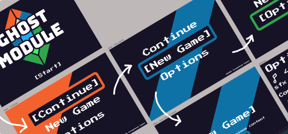
Let’s transition to a specific area: the Main menu. This is what the player sees as soon as they start the game, so messing up and providing the player with cognitive dissonance can impact how much they’re going to enjoy the game. If we keep our theme in mind while we’re developing the main menu, perhaps most of the story has been realized, we can connect it to the game. We could even place the menu as part of the world, like a road sign we’re reading that directs us to our next destination.
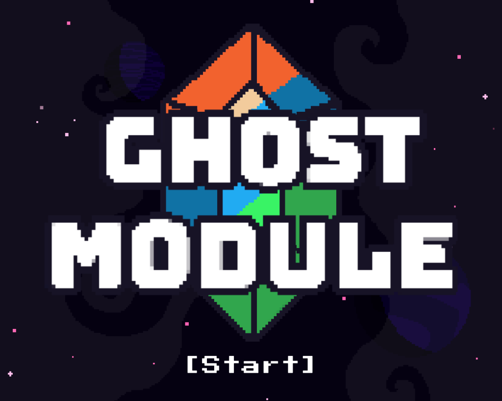
The example that I’m working on, a small bullet-hell shmup called Ghost Module, has the player destroying crystals that transport them into alternate dimensions. To play along with this idea, the very first screen the player sees (which I’ll call the splash screen) shows the name of the game with a large crystal behind the text. What does the term “ghost module” mean, and how does it relate to the crystal? By putting the image close to the text, I’m associating the term with a visual context. These are what is called gestalt, where things that are close are grouped together.
When we press the spacebar to start the game, we are presented with a brief animation of the crystal shattering as the main menu appears above it. Because the crystal shatters when the player pressed start, the player may associate the action with the consequence, that they were the ones that broke the crystal. In the actual gameplay, the player fires at the crystal to break it and shift into another dimension. This menu solidifies the action so when they are presented with the crystal in the game, they may be more encouraged to break it. Or at least, less hesitant. Notice how I keep saying “may.” It’s only when testing the game with players that we’ll know if this design will work. Toggling through the different choices shows different colored slashes across the screen, which represents the different dimensions the player can transition to.
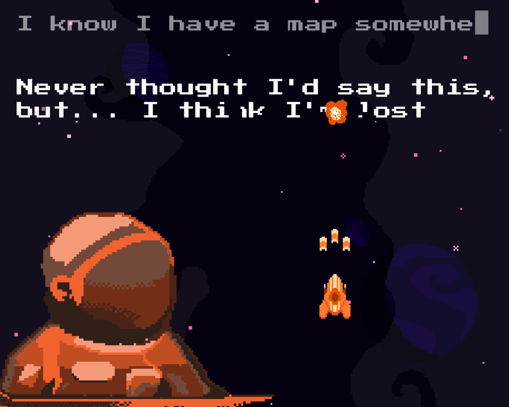
As we step away from the main menu, we step closer into the gameplay (or the results the player actually wants). One of the purposes of UI is to relay information to the player. With this new game that no one has heard of before, context should be given so the player can situate themselves into the world. Without giving the player information they may not know how to use the controls, or what their motivation is. Without this motivation, the player’s actions will turn reluctant, and the player will default to trying to complete the game.
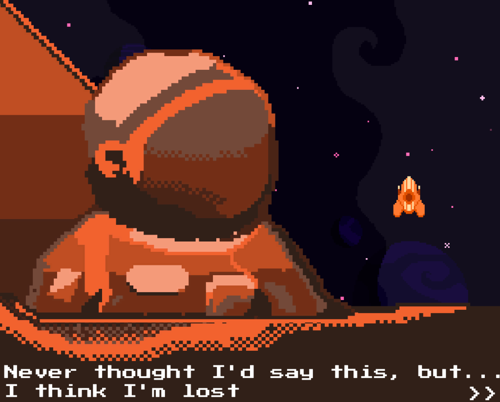
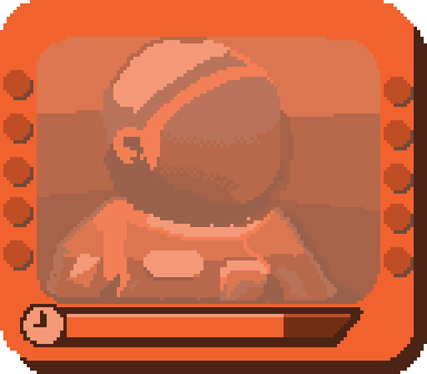
So to introduce segments of the game the player is given these “test scenes” where they’re exploring the different controls and learning about the universe they’re in. They are also connecting themselves to who they’re playing as. They are controlling the ship, but they’re not playing as the ship. They are playing as the astronaut who is controlling the ship. Placing themselves in this context makes it more believable because the player understands what it is like to be a human.
Once we move past the introduction, we finally get to what the player was expecting: the gameplay. Was getting to this point too long? The player didn’t take too many steps: click start twice, then through three lines of dialog, then arrived at the gameplay. There are games that involve many steps before reaching the gameplay, including customizing their character, assigning different stats, etc. While all these steps feel necessary to playing the game, they may not be as enjoyable (that’s not to say customizing characters couldn’t be a whole game in itself). Similar to the menu screen I presented, there are many ways you can design UI as to either solidify the theme and/or enforce a gameplay style.
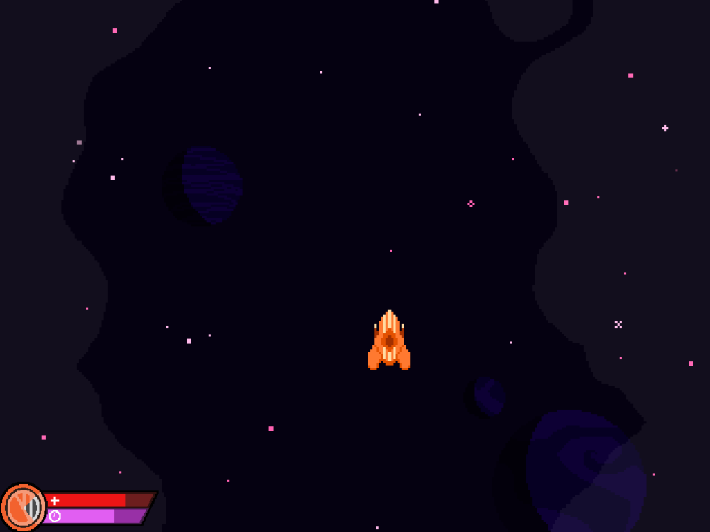
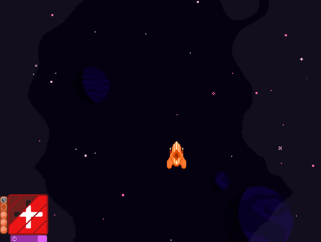
The main gameplay UI HUD is one of the most difficult UI components to get right. We want something that fits the theme, connects to the game, but doesn’t get in the way of the player if it’s not supposed to be. There are sometimes where I’ve made the UI purposefully in the way to create a crowded, overwhelming screen, but in the case of a bullet-hell game, that shouldn’t be the case. The focus that is being demanded from the player are the bullets they’re trying to avoid, trying to find a clear path to safety while also trying to destroy the enemy. There are different designs that I could implement here. Should I go for a more diegetic feedback, where the information about the ship is presented to the player in the game world? The health could be displayed on the back of the ship, or the ship could look more and more in a state of disrepair as it was hit from oncoming projectiles.
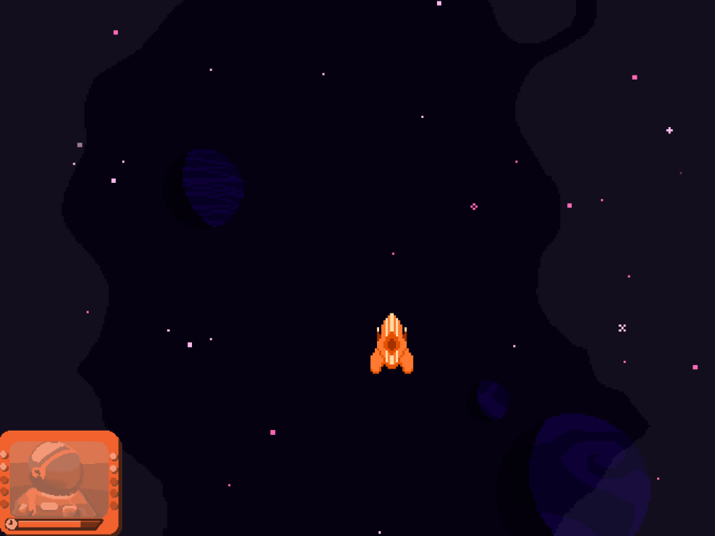
The diegetic states may be slightly limited. The only constant point in the game world is the player’s ship as it’s flying around the screen. Any of the other objects that appear eave the screen at a certain point in time, and it wouldn’t be wise to have something floating around the player that obstructs their view. The HUD allows more options. Perhaps there’s a standard health bar at the bottom corner, slightly tucked away. This choice is common in a lot of gameplay HUDs, so this decision wouldn’t be irrational to the player. Is it the best decision, however? Could there maybe be a better way to connect the HUD, player, and game world? What if we showed the player’s status rather than only the ship’s? While the face of the player wouldn’t be as animated, as they’re suited up, the state of their ship could be represented from the interior, as well as provide feedback of when they use different powerups.
Showing the state of disrepair could be tricky. Do we make the amount of damage the player receives ambiguous or exact? This depends on where the player restarts the level and how death is treated within the game. Are there only so many lives the player has? Do they restart the level completely over, or do they resume progress at the current stage? The game is still in development, so it can’t be answered right away, but by having these options we can determine what fits our game’s needs.
Looking for more design posts? Check out the rest of my blog! In one of my favorite posts, I take a deep dive in the design of Control.
Want a bullet-hell shmup that you can play? Check out Super Crome: Bullet Purgatory now in Early Access on Steam!