This is it: Design Time, the moment UX/UI designers love. But let’s not get ahead of ourselves. There’s more to it than making simple boxes and text on an aligned grid. Research and testing have to be done.
First step: Business Goals
What is the product? What need does it serve? What are the company’s goals on the product? How does it fit within their brand and/or product line?
I was contacted by a friend of mine to help him on an idea he had. The story behind the idea went as such “I wanted to read articles in Spanish to improve my understanding, but I didn’t know where to look. I then created a little site that sent me an email every day of a new article based on my skill level.”
If you’re a designer hearing this statement, you may have a bunch of ideas and questions swirling around your head. Let’s focus on those questions. These are off-the-cuff answers that need further explanation:
What is the goal of the site? -To send users a new article in Spanish once a day over email.
Who is the site targeted to? -Users who want to test their skills in Spanish. (Not necessarily learn it, this isn’t a teaching program, merely a teaching supplement.)
What information do we need from users? -They just enter an email address and a password. The articles will be sent to the email they entered.
What information should we display? -Users may want some kind of statistics shown to see their progress and how other people are doing.
How will we attract users to come back to the site (do they need to come back to the site?)? -Users would need to come back to the site to update their preferences, but there’s no reason why they can’t “set it and forget it.”
Showing a simple slideshow of the screens of what my developer friend had already, I was able to figure out the kind of functionality that was needed for his website.
After looking over what was there currently, I then went straight to the drawing board…
[ERROR, ERROR!!] I hear your internal red flags waving, sirens going off.
Okay, okay, here’s the real next step.
Second step: Research!
Does this application already exist? What are other language learning platforms like? What makes a good email? What users go to these sites? What are people’s mindset when using them?
Within our realm of biases, this idea appeared to be brand new. My friend already stated that the idea stemmed from him unable to find something that did what he wanted, but could there be other sites that had the same kind of behavior? I was only aware of some language learning sites like Duolingo, which I used as an application on my phone, was there a web version as well? I also heard word of an application called Tandem, where users are like pen pals attempting to communicate with someone in the penpal’s native language.
No idea is truly original. For something to be accepted, there has to be common/familiar elements within it. I couldn’t make a site that stuck to a triangular grid, where the navigation bar (if there was one) was going through the center, and article sitting on the top half and the user’s profile listed below (the idea might be cool and have and interesting look, but accessibility-wise it’d be a mess). No, we need these “securities,” these elements that we see in a lot of websites. If we feel comfortable about the functionality of the sight, then we feel that the site is more trustworthy. We’re not staring at the site, guessing how it works. We can safely give our information for the site to use to perform the action we want. That’s the important note here: results. Users want results. We don’t sign up for a new service to do MORE work, especially if it’s arbitrary or unnecessary. We use technology to make our lives easier, that’s what it’s there for. Signing up for this service gives the user an article as a result.
Let’s take a look at a few desktop language learning sites and see what we can make of them. This won’t be a thorough breakdown by any means, but a quick glance at different sites’ welcome screens.
Site 1: Duolingo

Especially on phones, Duolingo is one of the most popular language learning sites. While our site isn’t about specifically learning a language, it’s good to explore how other sites compare. If users can relate our site to a language learning one, then it may be more likely they see our site as an extension that could help them.
Looking at Duolingo’s splash page, we can see a very simplified intro for the user. There is a brief description of what it is and two call to action buttons below, one encouraging the user to start in the brighter green text and one saying they already have an account in a faded button. Duolingo’s tone is trying to be calm, relaxing, and friendly with its dialog. It also pushes the “fun” and whimsical tone with the font choices and cartoonish art style.

If we scroll down we see groups of information being accompanied by silly images of Duolingo’s mascot. Reading into the text, Duolingo is describing all the features it can give, as well as promoting bonus benefits like Duolingo Plus. If we never scrolled we would never see this information, as there’s no indication there is info “below the fold.” Our only way would be to scroll and/or notice the scroll bar. It doesn’t take too much effort to scroll, so users may be willing to try it if they’re confused about the site’s features, but it might have been better to include a small hyperlink that scrolled the screen down so the user would have noticed the useful information.
Site 2: Tandem

Very similar to the layout of Duolingo with the line of languages at the bottom, a description of the service front and center, and a call to action button. Tandem organizes its information a little differently, however, as the Login and Signup buttons are tucked into the top right, not at the center of the page. There are also more heading choices that allow users to go right to the results they seek from the site or see more information on the site’s blog.
Another interesting similarity Tandem has with Duolingo is that it has descriptions about the features of the site when you start scrolling down, but no indication that the user can do this. Actually, we find these extra descriptions common in a lot of the language learning sites (and a lot of sites in general). Does that mean it should be in the design of our site? Perhaps that question should be answered with testing. Currently the design offers a hyperlink to learn more about the site’s features on the FAQ, but maybe this hyperlink scrolls the screen down to reveal the information underneath.
The question that comes into play when deliberating this is “can users understand what the site does/can do without explaining it to them?” Answering this question may reveal that the site lacks common understanding. For example, let’s compare the names “Duolingo” and “Tandem.” To me, duo means a group of two, while “lingo” is a slang word to describe how someone talks. Duolingo’s name appears to be self explanatory in what they do: they allow you to talk in more than one way (for them, they are referring to languages). Tandem means together or at the same time (“in tandem,” for example). When I hear the word tandem, I think of a bicycle, or to the popular coffee shops with the same name in my town (whose logo is that of a tandem bicycle). The word Tandem already has a solid definition or image in someone’s mind, but in no part of the name does it suggest a language learning platform that’s basically a way to speak to a bilingual pen pal. The name of the site I’m working on isn’t set in stone, but it’s important to keep in mind trends and how information about sites can be given to the user without telling them anything directly.
Third step: Designing
What should we take from our research? How can we improve upon current systems? How can we make the initiation process as perceptibly simple and easy as possible? How do we provide feedback?
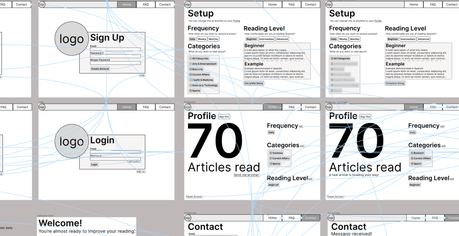
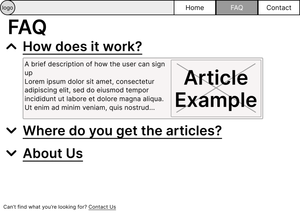
While the goal of the website was to provide users with articles in Spanish based on their selected skill level, I had a more focused design goal: Make the sign up scenario as quick and simple as possible. Once someone has signed up to the platform, the user would immediately start getting the results they wanted. To me, that means placing the signup and login buttons front and center on the opening page. The original designs don’t even have a welcome page, it goes right into signing up for the service. Theoretically, this isn’t a problem, and could still work fine. The user could feel too forced to sign up, however, and back out. The new intro page that I introduced presents the user with more options up front. It gives a brief description of what the sight is used for, offers the user a way to either sign up or login (if the user had an account, they would feel like the effort they did to signup was wasted if we always presented a signup form first-hand), and presents a clickable question that they might have when observing the page. This link sends the user to the FAQ page with the question drop-down description open (I’ll talk more about this when we work through the flow).
Upon viewing this first page, we are immediately presented with different pieces of structure. We’ll start with the navigation bar at the top. Is this needed? Does it take up too much space? It’s important to acknowledge when designing that each part of the design takes time to implement, so each part needs to serve a kind of purpose. The navigation is telling the user both what options are available to them and where they’re currently located. By knowing where you are currently, you are more able to determine where you want to be. If the user needs more information before signing up to the service, they know by clicking the FAQ will hopefully answer their questions, but if they have a deeper problem or find something wrong with the system, they can contact the developers directly. Even though the developer and I see this as a simple programming, offering solutions to the users’ problems up front provides clarity and trust.
Moving our eyes down the page, we see more structure in place (though we may not know it yet, if it’s our first time). There are three things outside the navigation bar that are clickable, can you spot them? This splash/intro screen uses a combination of both text hierarchy and input hierarchy. Text hierarchy involves presenting in order of importance to make it readable and clear. The tagline tells the user what the site is all about, while the text below (the buttons) allows the user to perform these actions, an the the smallest text underneath (the hyperlink) gives the user a better description if needed. Button hierarchy could be even more simple than text hierarchy (in our case, at least). I need to display to the user what is both interactable and what is the most important thing to click on. The filled “Sign up” button differs more visually than the empty “Login” button, attracting the new user to click there. While the link below doesn’t push the user through the signup process, it does offer the user to explore and learn about the site.
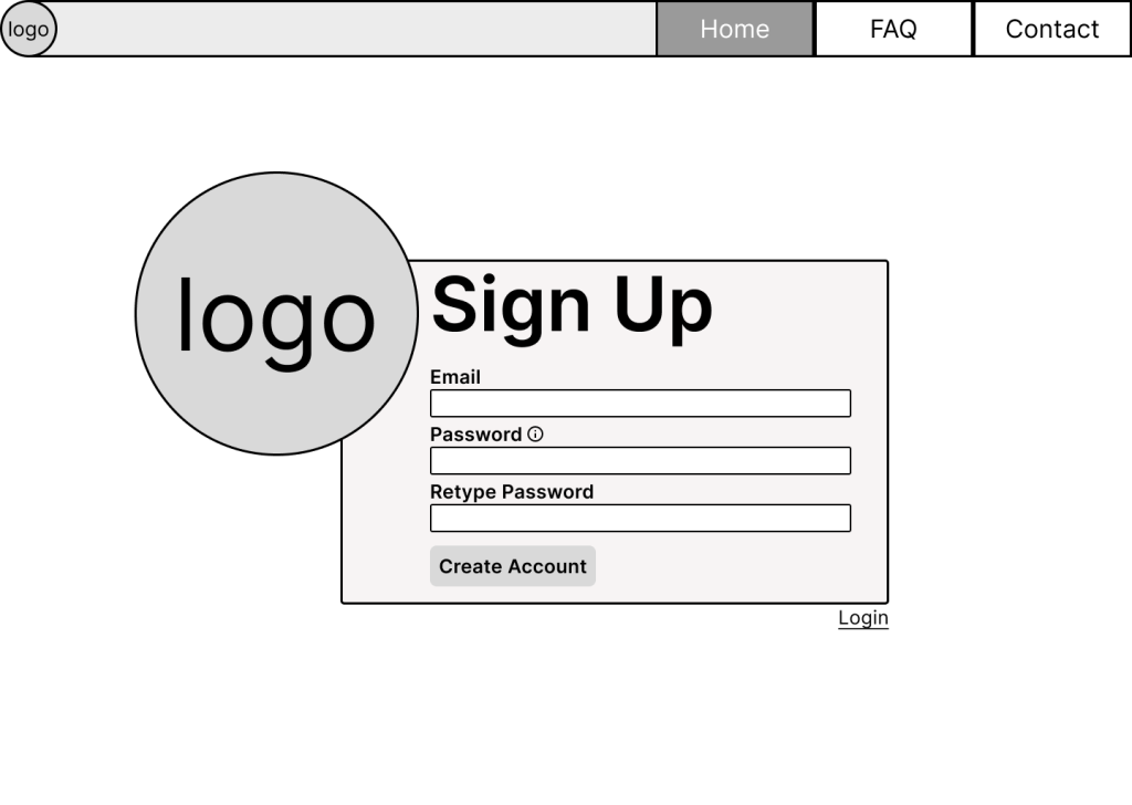
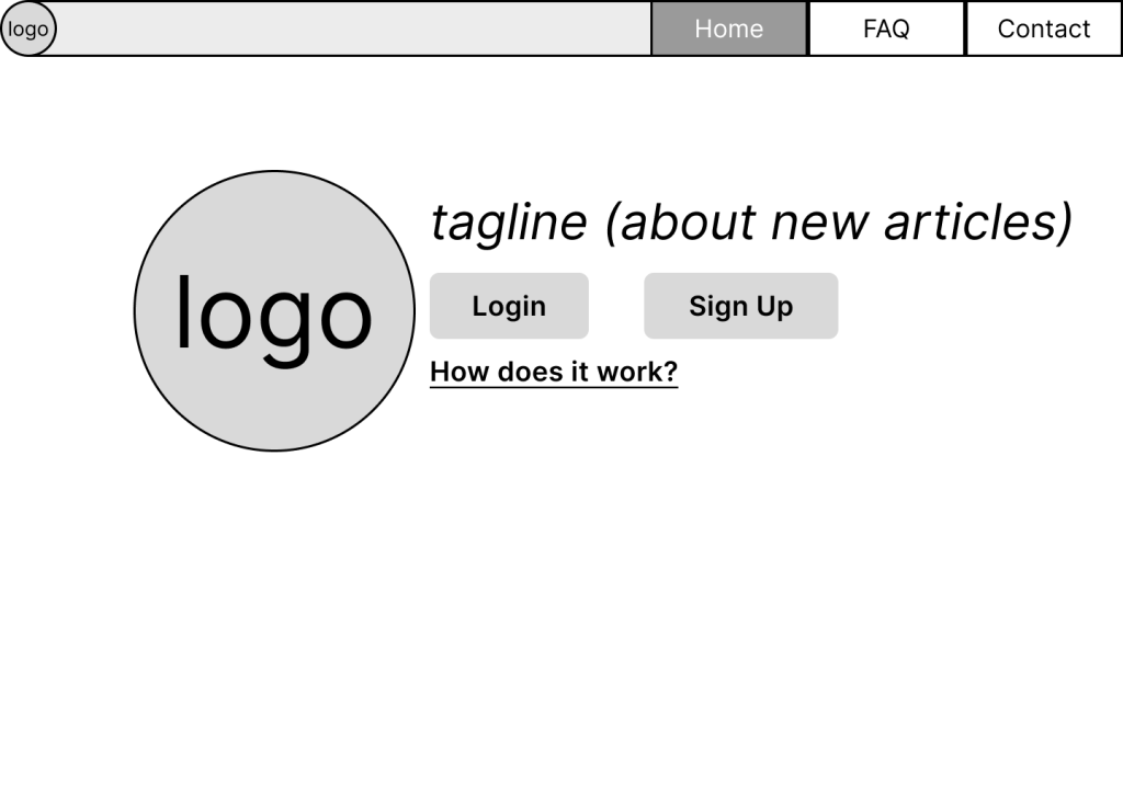
Let’s work through the flow of the site a bit more: The Signup and Login screens. The Signup screen shows a few text boxes with their labels sitting above. The “i” hint displays a pop up that tells the user what qualification the password needs to be accepted as a “strong” password. This layout as well as the Login layout are pretty similar, except for the fact that the Login layout hoes not include the password hint and doesn’t need the user to retype the password. Why should we have the user retype? This goes again to our need to solidify the user’s trust. I’ve experienced many sites that I’ve signed up for where it doesn’t ask me to type the password again. Of course password boxes replaces all the typed characters with asterisks so we can’t see what we typed (unless there’s an eyeball icon to peek at it). This means I technically could’ve typed ANYTHING for my password. I could’ve misspelled it without realizing it, then to find out later that I can’t get into my account. To avoid this error and possible headache, requiring the user to retype their password can check if the password is what the user actually wanted. I also say “Retype” instead of “Confirm” just so I’m as clear as possible to the user what I want them to do.
The way I layout forms and information matters. I want this site to be as accessible as possible. I want the site to be able to be understood with a screen reader, just as the articles we present to the user are. This means putting the descriptions and requirements before the input boxes, and not having descriptions disappear when users click within them. While these kinds of features may be interesting, if the text description disappears and the user clicks away, they may not remember what goes into that text box. If we look at the next screen, the Setup view, we can see the structure still being followed.
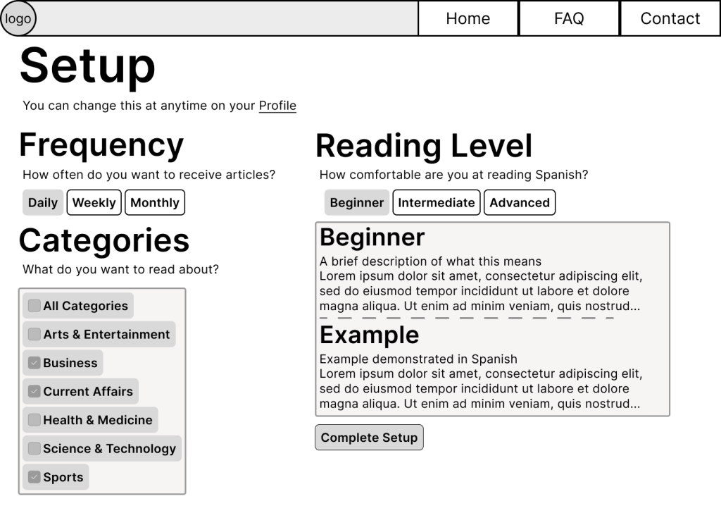
As stated previously, my goal with designing the site is getting users set up as quickly as possible. That means the Setup page for the user’s account needs to be as straightforward and easy to navigate as possible. The standard with a lot of the pages I design for the site is reassurance. Directly underneath the Setup heading, I’ve put in smaller text that the user can edit at any time in their Profile. The goal of this is to reassure the user that these choices are not set in stone, and can be changed to whatever they want at any time. The hypertext link of the word “Profile” brings the user to their profile page (which is where Home directs to now that the user has signed in). If the user were to not select any choices before coming to their profile, a standard set of choices (any article for beginners sent daily) would be assigned. Having this hyperlink directly to the user’s profile can show them the navigation hierarchy of the system, and lightens the cognitive load. I could have said at the bottom of the screen that the user could change their profile as well as how to navigate to it, but that would be both leaving questions unanswered to the user as they were filling out the form as well as them having to fumble around the system.
There are negative side-effects to having this hyperlink too soon, however. The user could click it, get to their profile, then be stuck wondering how to get back to the setup screen. This will come with user testing to find out if they actually clicked the link or not. Currently the user can’t go back to the Setup screen, as they can do all that they need to do on their profile, the setup of the profile just has a slightly different layout. These negativities need to be tested to see how detrimental they are, if at all.
Going through the rest of the Setup page, we see there are three main choices the user has to make: the frequency of articles, what are the contents of the articles, and the level of difficulty the articles should be. Similar to the main Setup heading, each section heading has their own description of what is needed from the user. This is because this site may be using terminology that the user isn’t used to seeing. If this is a brand new service to the user or if they don’t fully understand how the site works, then this will help explain what is needed. These “definitions” of the heading terms also helps with their confidence of the system. Someone could ask the user what does the frequency mean, and the user has a definition for it directly underneath.
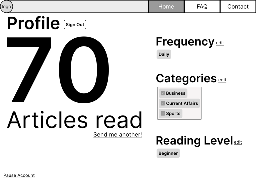
Perhaps this could be more simplified. What if I were to take out the header description text? If we peek at the profile screen, I’ve done just that. Now that the user has moved past the Setup phase, it’s assumed that they more clearly understand what the sections mean (this is an assumption, however, and possibly a poor one depending on testing). By removing this text and hiding the various options for each choice, I’ve condensed it down into one column. This allows me to display more exciting messages to the user, like how many articles they’ve read, and give them the opportunity to receive another. What should be displayed in the user’s profile besides editing their preferences is debatable. If we want a “set-it-and-forget-it” model, then nothing should really be displayed here, as the user won’t need to come back to this screen frequently. Perhaps the user would want to see how their stats are compared to other readers around the world. In that can, a kind of bar chart or line graph can be shown. Currently it’s just the user’s number of articles they’ve read (which increases each time they open an article in their email), used as a subtle way to keep the user wanting more.
When presenting the options for each of the user’s preferences, I wanted to provide the information to them in a way they can easily obtain it. If I were to have each selection in a series of drop-down boxes, that means the user wouldn’t know of all the available options until they clicked it, forcing the user to do more work than they need to. By presenting all the options to toggle through, they can easily know what state their choices are currently in so they can base it out of all the options available.
In the user’s profile, the sections may need to be edited because currently it presents their choices as the buttons from when they toggle. This could give the wrong impression of what the user could do with this choice listing, and cause them to select the non-button before noticing the hyperlink “edit” that allows them to edit these choices. An alternative would be to present the information where it didn’t resemble any of the buttons or clickable items previously shown.
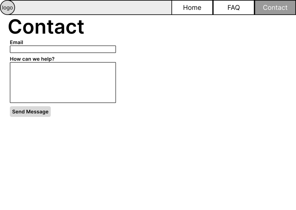
I won’t go over the FAQ and Contact section too much. The two screens vaguely resemble ther other screens the user has gone through. While the FAQ presents a clickable word drop-down, it still indicates that the words are selectable by using the standard hyperlink underline.
What might be the most important information of the site is not within the site itself: the emails. This is the whole point of the site, so emails to the user need to be clear and confidently expressed as possible. As the user travels through the Setup phase, they will already start becoming accustomed to how the email will be laid out. Starting with the verification email, the email title and minimum description (the subtext given before the user clicks on the email) provides a helpful alert as well as a brief description of what it is. This is to prevent users thinking that they’re receiving spam email, and further providing them with confidence. If you don’t want an email is about and you received it from an unknown user, you are more than likely going to ignore it or put in your spam folder. Once these emails reach Spam, than any future emails from that site will also end up there, providing the user a lack in the service they just signed up for.

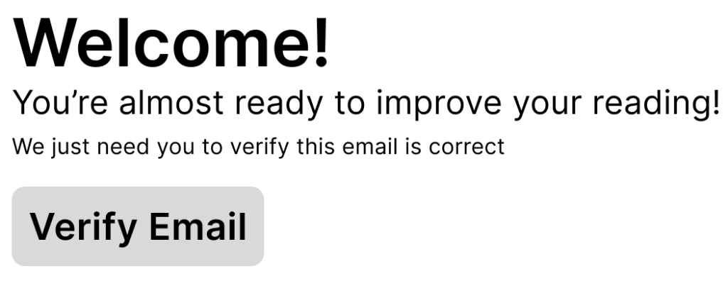
While I want these emails to be inviting, I don’t want them to be friendly to the point of disingenuous. If the email text is excitedly over the top, the user may roll their eyes and have more of an excuse to ignore them. We’re trying to make these emails the least annoying as possible. This means the welcome verification email is the most important, as it sets the tone for what the rest of the emails are going to be like. Should I welcome the user in the language they’re trying to learn, or would that be too tacky? Should I say “welcome” in the first place. I want the user to feel like they’re making the right choice, so creating a happily satisfied mood may make the user feel like they’re on the right path without it feeling obnoxious. The second sentence “you’re almost ready to improve your reading” may be overkill. The third line explaining why the user is getting the email may be enough.

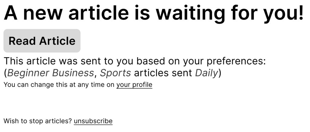
The next important email is the one that the users might receive daily: the email containing the article. These are the results the user is expecting. We want the email to be a happy alert, but avoid again the exasperation of an overbearing personality. With a brief little message letting the user know they have an article available, the result is shown to them almost at the top of the email so they can get right to reading it. A description below the button to the article explains why this article has been chosen, and provides hyperlinks back to the our site if they want to change their preferences for next time. It will also allow the user to unsubscribe and stop the articles.
The way I handled pausing your account may be slightly different (and perhaps more dramatic) than other sites that allow you to do such a thing. To start, a user cannot close their account immediately. Once they pause their account, they have 30 days from then to activate it again, otherwise it will be deleted permanently. Perhaps there should be an option to delete your account outright, just to give the user as many choices as possible. My justification for not needing an account deletion straight away is giving the user time to think about their choice. If they found that they kind of miss receiving those articles, then they can easily activate their account. The site also doesn’t do any more information in the background. Once the user stops their account, they won’t receive articles, but these articles aren’t being stored anywhere, so no other data is tracked/processed.

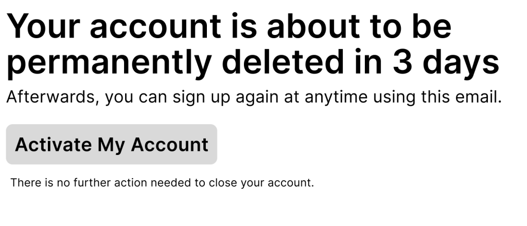
Notifying the user that their account is about to close is a tricky task. What is the best ratio of warnings that need to be sent out? Testing would be needed, but I think sending one warning message out 3 days ahead of time will help the user in deciding if they want to really continue the service. Any more ahead of time will make the user feel relaxed and not be concerned, and if there’s only one ahead of time that’s more than a week, they will forget to update their account. The email also reminds the user that they can leave their account to be deleted and can restart it at any point afterwards. While informative, this statement may give the user justification to quit, seeing as no problem is found in doing so. Another email that can be included is the day the user’s account has been deleted, letting them know that they can restart if they’d like to. This can work as a secondary email to the 3 day warning and make the user realize how much they miss it.
Reflection
Now I know I didn’t go over everything. I merely gave a brief overview of the design process and showed some simple wireframes. Just by talking about the wireframes I’ve noticed places for improvement and changes, but being able to prototype in Figma will also allow me to get the site design out to testers quickly so I don’t have to wait for my friend to implement the designs. Thanks for reading this far and I hope you learned something from it all.
Have a great day!
If you’re looking for some great UX books, you should check these out:
The User Experience Team of One by Leah Buley
Writing is Designing by Michael J. Metts and Andy Welfle
A Project Guide to UX Design by Russ Unger and Carolyn Chandler
Design of Everyday Things by Don Norman
Emotional Design by Don Norman
Don’t Make Me Think by Steve Krug