
House of Mundane is a small puzzle game created as a solo project by myself. I love exploring the idea of making boring activities (petting your cat, watering your plant) interesting. This game explores that idea of living a normal life in your house. It is only when players start to experiment with what they’re doing, or change up the pattern of their normal life, that the puzzles become apparent. The game is limited to only 6 buttons (four directional buttons and a primary and secondary action buttons), but in each scene the button performs a different behavior. The player is constantly exploring and experimenting with what they can do.
So I have this goal of a simplified, no hands-holding experience, but how do I develop an interface that compliments it? Should there be an interface at all?
UI is interesting in games (well, it’s interesting everywhere), but most of the time the information presented is not in direct connection to the game world. What I mean by this is that the world that has been created doesn’t physically interact with the overlay on the screen. There are some games that break this mold, using what’s called diegetic UI. A prominent game that started this idea was the third-person horror shooter Dead Space, with the player’s health seen as a physical part of the player’s uniform. As much as I would have liked to not include any kind of UI within the game, some puzzles require the use of objects obtained from a different room.
Do I need to tell the player what they’re holding? You could say no, and leave the mystery up to the player. Interactions might seem surprising because players wouldn’t know that they were holding the item. You must keep in mind: THIS NOT THE PHYSICAL WORLD. I’m not sure of all the elements and objects that surround me within the game. I can only infer what is happening from what I can see. Therefore the game needs to be descriptive to the player.
“Well hold on,” you may say, “Why is your game only in black and white if you’re trying to be descriptive?” When we experience the world, we tend to fill in the parts that we don’t see or don’t know. That’s why the dark basement is scary, or why we assume what other people are thinking. We fill in the blanks that we don’t know. So why have UI? Because I’m helping you fill in the blanks. By telling you what you have, where you can go, what you can select, I’m giving you choices. I’m showing you affordances; I’m telling you that you can manipulate the scene in some way.
If we look at the Usability Heuristics, we can see one of the most important ones: “Visibility of System Status.” Because the digital world is intangible, we need feedback to tell us what is happening.
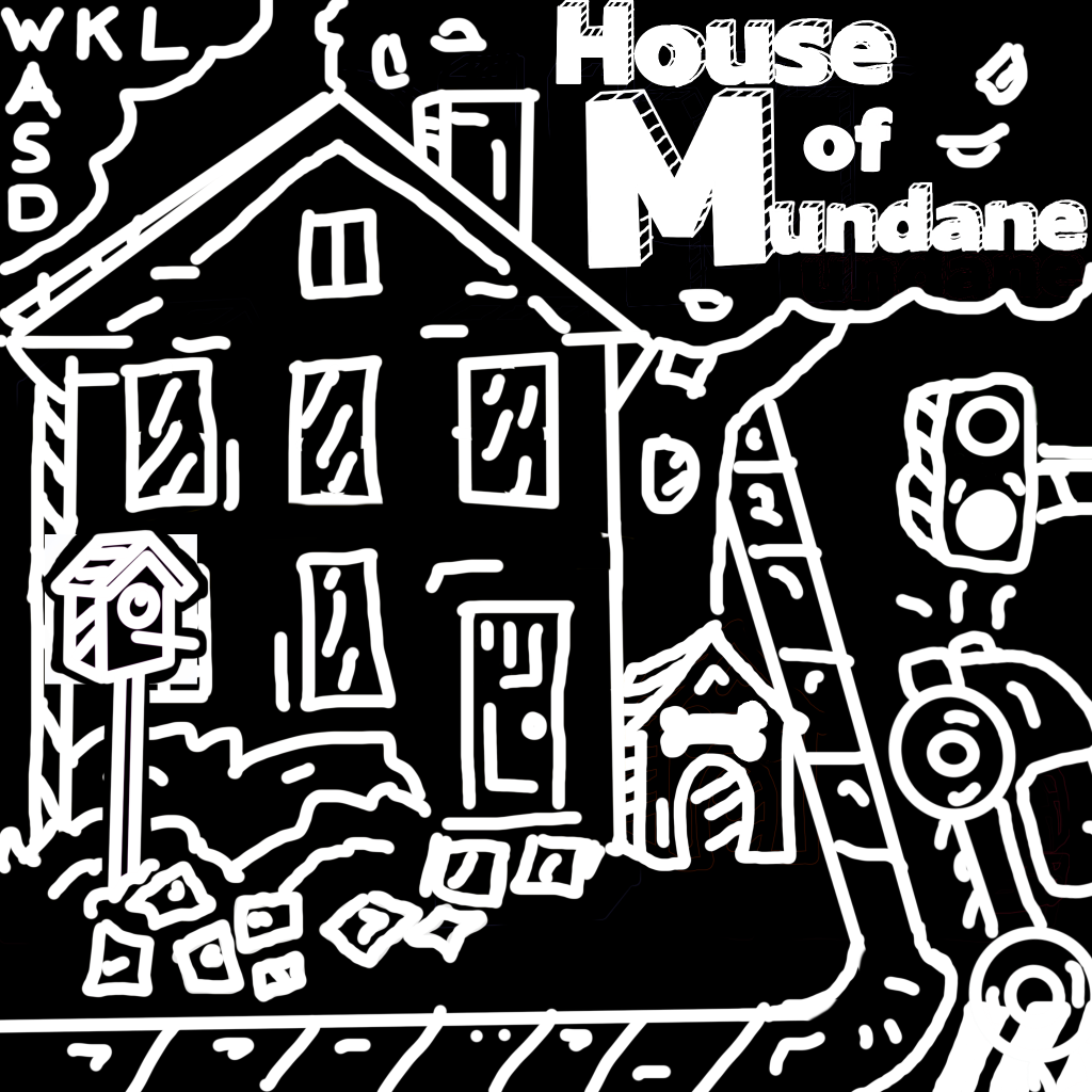
This first scene I consider the “Home” scene (not just because there’s a house). This is where the game starts. This is basically the test location where the player can experiment with the controls. The player is only given what buttons are available, but as I mentioned earlier, since every scene has different interactions, there’s no reason to list them here (also I want to give a surprise to what happens). Ironically enough, the player may never get past this screen. Should there be a failsafe for if the player doesn’t know what to do? Possibly, but the game isn’t that long to begin with, and it’s purposefully a puzzle game, so I believe it’s okay for the player to be stumped for a bit (of course testing will need to happen to see how difficult the puzzle really is).
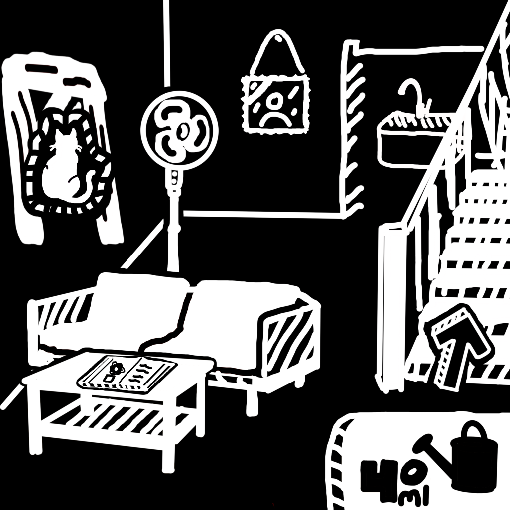
This second scene is where the real gameplay comes in. Here the player can make many choices, each moving ahead the overarching story in a small way. There is actually an order to which the puzzles need to be done, but do I fault the player for not knowing the correct order? The goal of the game is experimentation, so making the choices linear and critiquing the player is not what I want to do. If the player messes around with the buttons, they’ll find that different items in the room will become highlighted.
At this point in the game the player already performed some of the actions available to them. In this case, they filled up the watering can to the indicated amount. This indication tells the player that they can use the watering can in some way, but it won’t become apparent until they explore the scenes upstairs.
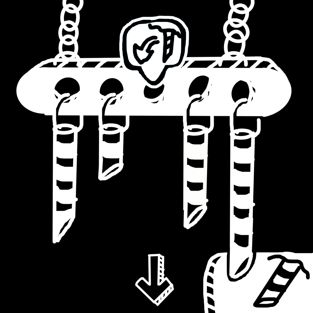
In this final scene we have a variety of states that the UI can be in depending on the inventory of the player. If the player were to visit this scene without retrieving the last wind chime, the UI would not show the inventory on the bottom, and would not place a wind chime in their inventory if they were to pick it up. The hovering icons point to what the player can do in the given location, and in terms of having no wind chime, they won’t see an option to place a chime when all the other ones are available.
UI needs to be adaptable to various states that the player can be in. The biggest benefit adaptive UI can have is providing strong feedback. Because this game is visually and audibly simple (only ambient room noises are heard), the feedback from the player’s interactions is important.
Thank you for reading through this brief overview! Hopefully I’ll have the time to bring this full project to life. If you want to view my previously released games, check out my portfolio.